It is often considered unwise for consumers to buy the very first version — aka “gen one” — of any consumer electronic product that’s the first of its kind. Wait for gen two or three, the belief goes, and get a more refined and polished product.
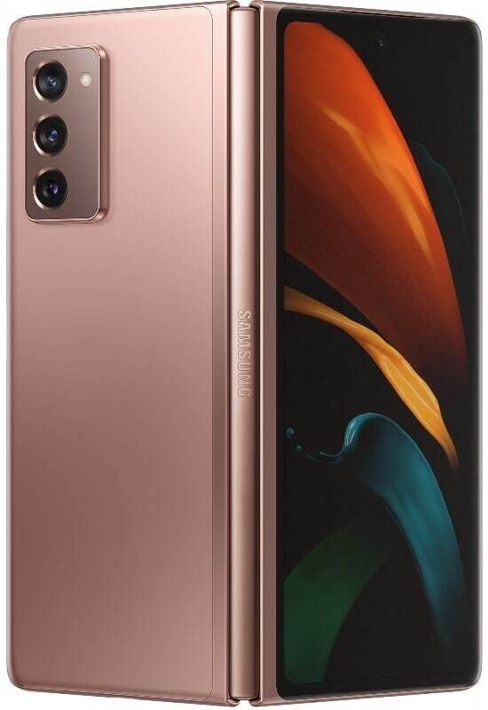
This is evident the second you pick up the Samsung Galaxy Z Fold 2. I’m not just talking about the much larger outside “cover screen” or notch-less main 7.6-inch screen that immediately attracts attention; but even just holding the Fold 2, you’ll feel that it’s a more polished piece of hardware. It feels denser in the hand, more mature.

The Fold 2 is confirmation the cutting edge future of smartphones is here.
That the Galaxy Z Fold 2 improves over the Fold 1 such a large amount is a huge compliment coming from me because I was not one of the many who doubted the original Galaxy Fold; I was sold on the idea from day one, I paid my own money for a unit and I have never had regrets. The original Fold to me was a cutting-edge device that’s a hint of the future. The Fold 2 is confirmation that that future is here.
I’m on day one of what will surely be a long time with the Fold 2 – when I return this review unit to Samsung, I am already planning to buy my own – and here are my immediate takeaways.
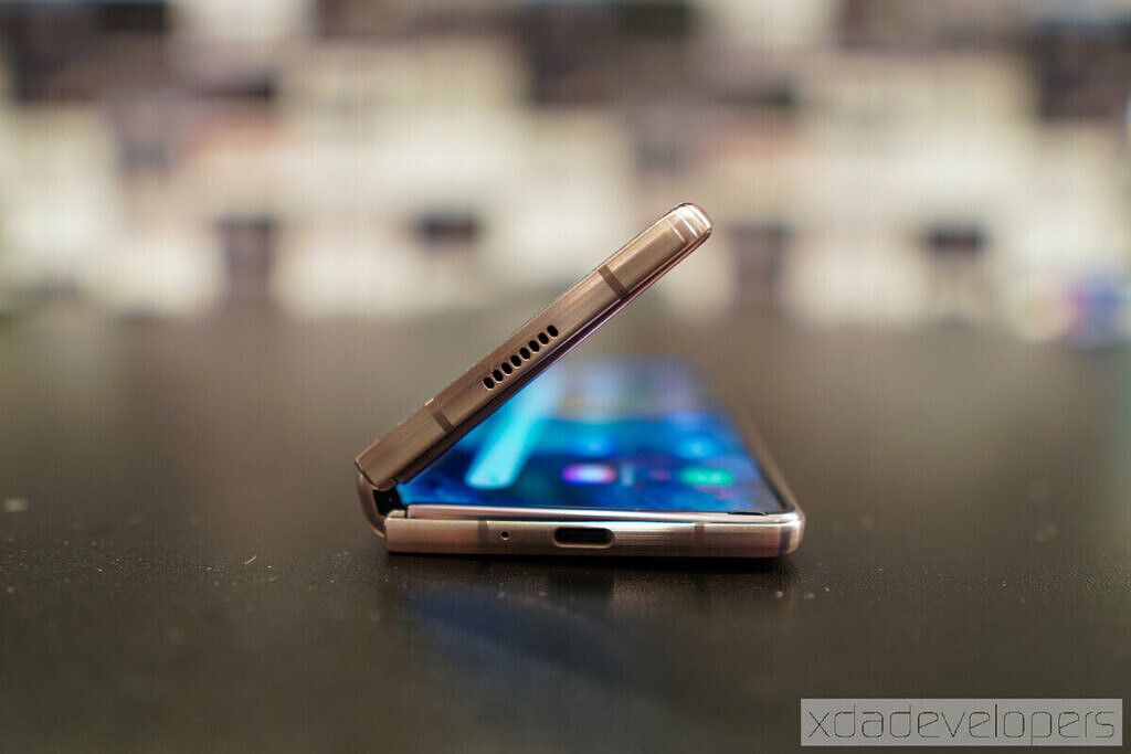
The improved hinge is legit

The original Galaxy Fold, if you hold it tightly in folded form, wobbles from the pressure of your grip. That’s not due to a year of wear-and-tear; it was like that out of the box.
I didn’t think much of it at the time — after all, this is a tablet that’s been bent in half, so of course, there’s a bit of movement if you press into it, right? Well, the Fold 2 doesn’t have this. Even in folded form, it feels like one solid slab, much like the Huawei Mate XS did.

Opening the hinge now feels just like opening a laptop, you need just enough force to pry it open, but the second you stop pushing the hinge stays in place.
We covered why a hinge that stays in place is ideal for this device in our hands-on last week, and we’ll dive deeper to test over the next few days, but just a few hours in I already have found it highly useful. For example, I watched a YouTube video over dinner with the Fold 2 propped on a desk in tent mode.

It is as much a phone, as it is a tablet
The original Fold always felt to me like a tablet that can masquerade as a small phone for short periods of time. I say “short periods” because the outside cover screen is so small you can’t really type on it comfortably. So you’ll want to unfold it more often than not.

With the Fold 2, I have used it folded almost as much as I have in the unfolded form so far, which is a testament to how functional the device is even in smaller form factors. Overall, it feels equally capable as a tablet or a small phone.
Keyboard dilemma in unfolded form

Gboard doesn’t offer a split keyboard option.
The Fold 2 has two keyboards installed out of the box: Samsung’s own and Swiftkey, pushed here due to the close partnership between Samsung and Microsoft. Both have been optimized for the Fold 2’s tablet form factor, as they automatically switch to a split keyboard when unfolded (and standard keyboard form on the smaller outside screen). This is great because the 7.6-inch screen is slightly too wide for most people to type comfortably if the keyboard isn’t split.

But SwiftKey does let you split for easier thumb typing.
However, I prefer to use Gboard (I think many reviewers share the same feelings), but Gboard doesn’t offer a split keyboard option. This has resulted in me using Gboard in folded form, but switching to Swiftkey in unfolded form just to take advantage of the split keyboard. I’m hoping that Google will consider optimizing Gboard for foldable devices because they tend to have larger screens.
One UI takes advantage of more screen

So far, most apps I’ve used work well on the small and large screen. Instagram, in particular, has been “fixed” on the larger screen. On the original Fold, Instagram would stretch the entire canvas, and due to the odd aspect ratio of the large screen, meant Instagram Stories would be cropped at the top and bottom.
That’s been fixed now, although not in the most elegant way: Instagram now runs on the large screen in a rectangular 16:9 aspect ratio, with major pillar boxing – large bars on left and right of the screen – that looks quite odd. But at least now you can see IG stories in its full glory.

Elsewhere, you have the option to display content in a more tablet/computer-like view, with more information on the screen, or just a standard smartphone-like view, but with everything appearing larger on the screen. Apps such as Slack, Gmail, Samsung Internet, and Files all take advantage of the larger screen with a multi-paned layout.
Galaxy Z Fold 2 is the perfect device for digital nomads

The Galaxy Z Fold 2 feels like a device made for someone like me — a digital nomad who writes/edits words for a living and doesn’t like chained to a desk. For years, I have always sought out the lightest laptop/tablet around, all so I can have a work machine that I can whip out wherever I am in the world and work.
No matter how light a laptop gets, however, it is still ultimately a second machine I have to carry in a bag. The Galaxy Z Fold 2 is a single device that sits in my pocket that can, in a pinch, double as a computer. I have a foldable keyboard in my backpack at all times. It should be a great companion for the Z Fold 2.
Join me tomorrow for more after my first full 24 hours with the Galaxy Z Fold 2!
- Got an Amazon Store card or just prefer shopping on Amazon? You can now pre-order Samsung's foldable on Amazon ahead of its release next week! Both the Mystic Bronze and Mystic Black versions are available, and with the Amazon Store Card, you can pay $166.67 per month over 12 months with 0% finance!
The post Galaxy Z Fold 2 Ongoing Review Day 1: Keyboard Dilemmas and more appeared first on xda-developers.
from xda-developers https://ift.tt/3hblB4h
via IFTTT


No comments:
Post a Comment